A sign of the times
October 1, 2021
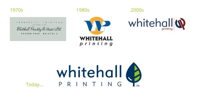
Autumn often feels like a time to shift gear and welcome change but this October in particular marks the start of a new chapter in the Whitehall story. The multiple lock-downs provided us all with ample opportunity to reflect on our purpose, values and direction. Our desire to make a positive impact as a family business felt a little at odds with the defiant ‘trident’ logo we’ve sported for the two last decades. We needed our brand to better represent our true identity; a strong family business with an environmental approach, and a passion for the artistry and skill of printing. Whilst our logo may have become dated, we are proud of the heritage of our company and want to celebrate it’s unique path to where it is today.
Sustainability
Embedded with our environmental ethos and ISO14001 (2015) objectives is a commitment to promote awareness of greener choices among our clients. We want to differentiate ourselves as a supplier of environmentally conscious choices, but also to support the wider aims of our industry in re-claiming the reputation of paper. The assumptions that print and paper are bad for the environment or wasteful remain widespread and we printers have a long way to go to re-educate consumers about paper; the the world’s most recycled medium. Put simply, responsibly sourced paper plants more trees on the planet than it fells. Rapid new forest expansion (up by 50% in the last 50 years) is a crucial part of the fight against climate change, and the protection of ancient, carbon-rich forests. A tree symbol seemed the obvious choice to align our logo design with our strategy.
Shape
Having identified the values most important to Whitehall, we wanted the icon to do the same. Bringing together the themes of family roots, quality printing and sustainability; the ink-drop-tree icon was born! It’s spear-like shape is reminiscent of our former ‘trident’, created to symbolise innovation and one of our key strategies – continuous improvement. The weight of the two branches (to represent two brothers) is matched to the text line weight for design consistency.
![]()
Colour
Having worked with thousands of brands we were conscious of the fact that brand awareness is heavily influenced by colour – estimated to make up a staggering 80% of brand identity. We opted to retain the familiar navy blue as our primary colour and to combine this with a verdant green vein of sustainable forestry. Of course accessibility and inclusion are also part of our modern outlook, so we created single-colour and reversed-out versions, to increase legibility and contrast against a range of web and print backgrounds.
Typeface
Looking further back into our company archives, we came across a very early Whitehall logo; a fanciful serifed font that was very elegant (if a little hard to read!) combined with a straight, formal and widely-spaced typeface.
Somewhat nostalgically borrowing from the past, we introduced similar letter spacing to the word ‘PRINTING’ in a lighter weight. By contrast, our main ‘whitehall’ font, with its modern, angled edges and all-lower case, was left unchanged to remain recognisable to our long-standing, loyal clients.
After the disruption of the past year, we’re incredibly excited to move forward with our refreshed brand. We hope that our renewed focus will support our clients to recover too…with sustainable print that re-connects relationships, old and new.
Do let us know what you think!
Tags: brand development, greenprinting, logo design, sustainability, vegetableinks
Categorised in: News

